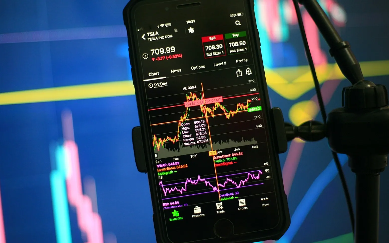
A forex chart plots the exchange rate of a currency pair over time: time runs along the horizontal axis, the price of the base currency in units of the quote currency runs up the vertical axis. Line charts show only one price per period, while bar and candlestick charts show four — the open, high, low and close. Learning to read them is mostly a matter of knowing what each mark stands for.
This guide explains how charts are built. It does not cover trading strategies, and nothing in a chart tells anyone what a price will do next.
Start with the pair and the axes
Before reading any shape, check three things:
- Which pair is shown. A rising EUR/USD line means the euro is gaining against the dollar. If the pair were flipped, the same move would appear as a fall. The guide to how currency pairs are quoted explains base and quote currencies.
- The price scale. Most charts use the right-hand axis for price. Small moves can look dramatic if the scale is tight, so read the numbers rather than judging by the slope alone. Moves are usually counted in pips.
- The time zone and timeframe. Charting tools let you choose both; a chart set to an unfamiliar zone can make a session's activity appear at odd hours.
Timeframes
Each point, bar or candle on a chart summarises one period. That period can be one minute, five minutes, an hour, four hours, a day, a week or a month. The same price history looks very different depending on the choice:
- short timeframes show every small fluctuation and a lot of noise;
- daily and weekly charts smooth out the noise and show longer swings;
- switching between them helps put a single move in context.
Line charts
The simplest chart connects one price from each period, usually the closing price, with a line. It gives a clean overview of direction over weeks or months, and it is the format most often used in news articles. What it hides is the range: a day on which the rate swung widely and returned to where it started looks identical to a quiet day.
Bar charts (OHLC)
A bar chart shows four prices for each period, which is why it is also called an OHLC chart:
- the top of the vertical line is the high;
- the bottom of the vertical line is the low;
- a small tick on the left marks the open;
- a small tick on the right marks the close.
If the right tick is above the left one, the price closed higher than it opened during that period. Many tools also colour the bars to make the direction easier to see.
Candlestick charts
Candlesticks carry the same four prices as bars but present them in a way many people find faster to read. Each candle has two parts:
- the body, a filled block between the open and the close;
- the wicks (or shadows), thin lines above and below the body reaching to the high and the low.
Colour shows direction. By common convention a green or hollow candle closed higher than it opened, and a red or filled candle closed lower, though the colours can be changed in most software.
What the shape describes
| Candle shape | What happened in that period |
|---|---|
| Long body, short wicks | Price moved steadily one way and closed near the extreme |
| Small body, long wicks | Price swung both ways but closed near where it opened |
| Long upper wick | Price rose during the period but fell back before the close |
| Long lower wick | Price dropped during the period but recovered before the close |
| Almost no body (a doji) | Open and close were nearly the same |
These descriptions are factual summaries of what already happened. Books and websites attach names and meanings to dozens of candle combinations, but a pattern is a description of the past, not a reliable forecast.
A note on volume
Stock charts often show trading volume beneath the price. The currency market has no central exchange, so there is no complete volume figure. Many platforms show tick volume instead — the number of price updates in a period — which is only a rough stand-in for activity on that provider's feed.
Mistakes beginners make
- Reading a chart without checking which way round the pair is quoted.
- Judging a move by the steepness of the line rather than the actual price change.
- Looking at one short timeframe in isolation.
- Treating a named pattern as a promise of what comes next.
- Forgetting that charts usually show the bid price, so the price paid to buy may be slightly higher.
Keeping notes on what a chart showed and what followed, as described in the article on keeping a trading journal, is a useful antidote to seeing patterns that are not there.
This page explains how price charts are constructed and is not a trading method or recommendation. Currency trading involves a high risk of loss; anyone considering it should get independent, qualified advice.
Questions? Write to us.
We read every message.
Across the sections
Tech
- Create Professional-Looking SVG Graphics With Online Editing Tools
- Editing Ready: Why and How to Convert MP3 to WAV Without Myths
- From First Call to Month Six: What a High-Performing SEO Agency Engagement Looks Like
- Beyond Activation: How to Maintain, Upgrade, and Make the Most of a Free Government Phone Over Time
Business
- What to Include in a Window Cleaning Brief for a Vienna Building
- Stand Out and Sell More: Creative Ways Digital Displays Elevate Your Brand
- Turning a Citation into Opportunity: The Value a Traffic Lawyer Brings to the Road
- Dental Partnership Agreements: Why You Should Never Sign Without a Dental Lawyer